Wednesday, 12 December 2012
My Digipak
This is my proposed digipak for my artist, it consists of six sides which all fold together to form a sort of booklet. The top three shots are all one shot. I filmed this pan from right to left purely for the purpose of my digipak. I used adobe after to alter the bluriness of the background so it brings attension and focus on the artist.
Monday, 10 December 2012
Magazine Advert
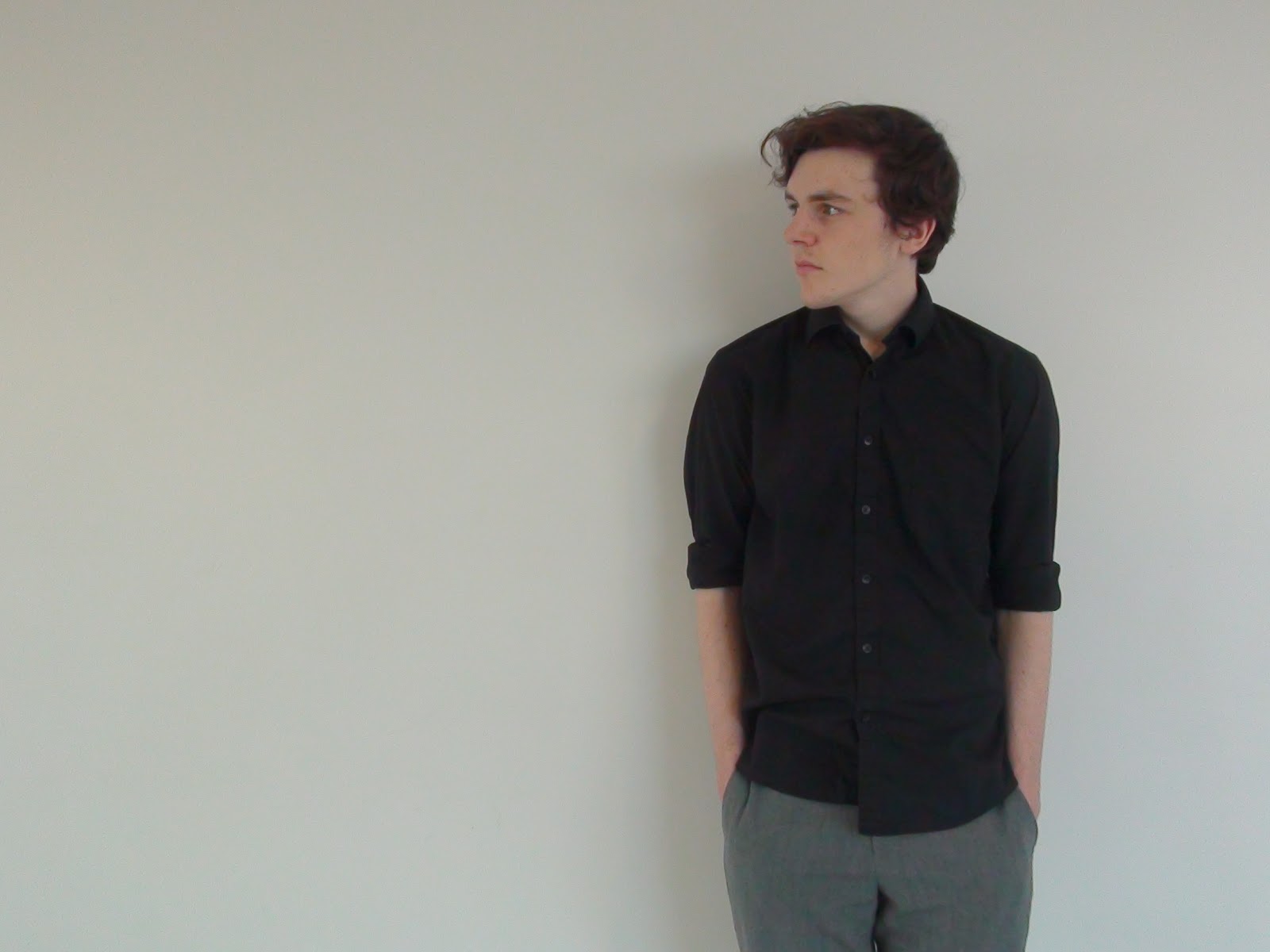
The pictures below show my progression of my magazine advert for my artist and album. After doing my research in what to include in an magazine advert, i have found out that certain things are needed. These are: the artist and album name, ratings from newspapers and music magazines, quotes and a shot of the artist himself, which should be pre dominant on the cover.

These pictures above are from a website whoch provides different fonts. For my album name and artist name i wanted a sort of handwritten effect, so i went on this website and tried some samples.
I came to a descision to choose the font jellyvakes which is the the fourth font down in the second picture.
This is a screenshot of my magazine cover in the making in adobe photoshop. I have had to learn about layers and special settings in order to make my magazine cover what i wanted it to be.
Here above is a picture of the amount of layers i had to use because each different text and image had to have its oen layer or it will effect other images and texts when trying to manipulate it. I have also named the different layers so i can easily select them without getting confused.
One tool i had to use was the magic wand tool. Originally this amazon logo had a black background which wouldnt fit on the advert becasue i wanted to place it in a space that had a white background. So i used the magic wand to tool to remove this black background so its looks like the logo above.
This is a screen grab of my magazine advert which is almost finished. The amazon logo no fits on the page, and i have quotes from other magazines with the album name and artist name clearly shown. I have already recieved feedback on this, the main improvement i need to make is that the top left corner is too cramped, i need to space it out more. I have given it some thought and came to the decsision to create a bit more headroom so i can make his name go across the top and give a little more space in the top left.
Friday, 30 November 2012
Editing photos
I want to add effects to my digipak photos to make them look better. I started watching tutorials on youtube on how to for example blur the backgroud of images, change the backround of images and also how to work with layers.
This image shows how i isolated the image of our actors face and blurred the background, this adds the effect to draw our attension to the actors face and makes it good to look at.
Digipak Photos
I decided to include shots from the other location to include in my digipak. Below are those pictures, some are stills from my video which i intended to use prior to filming it, and some and actual pictures i took. For my interior of m digipak, i want to have one image that stretches across all three sides, i have seen this done of professional digipak's and it looked atractive.
Digipak photos
All these pictures i took in preperation for my digipak. I wanted his face in front of a white clear background hence the 1st, 3rd, 4th and 5th shot. Also additionally, i wanted the shot where the tracks on the cd will go so i left a gap to the left of the artist in the second shot. I have currently taken shots from when we filmed that we might use for our digipak aswell.
Thursday, 29 November 2012
Editing on final cut
Here are some screen shots of my timelime in final cut showing my progression in producing my music video and editing.
Above is a screenshot of the shot where i have two images of the actor singing the same line but with different shots and locations. In the music video itself, the image to the right come in later but on the beat. I have cropped both images from the left and the right, and placed them on either side of the frame so we can clearly see both shots of the actors head.
This is a screen grab of my timeline in final cut. It shows all the shots and clips i have taken and how i have placed and arranged them according to the track and also where i want them to be placed. I have placed some clips on top of others so it makes editing easier when i want to cut quickly form one shot anther and also it keeps the timeline more spread out and easier to work with.
This is shot of the editing i did in terms of the color. In my video, there are two locations, one at the london bridge and the other in the drama stage classroom at our school. I have chose to have the clips form our school in original colour and to change to clips from the London bridge to black and white. To do this i have added the effect of colour corrector and i have reduced the saturation all the way down as you can see above, this turns the clip black and white.
Monday, 26 November 2012
Copyright Letter
Dear Copyright Holder,
I am an A Level student studying media requesting your permission to use Ian Brown's track ‘Longsite M13’.
With your consent, the track would be used in my current A2 level Media Studies project, which consists of creating a music video, including an album cover and a magazine advert for our new and upcoming artist.
If we receive your permission, this track would only be used for an educaional purpose and will be viewed by my media class, my teacher and the OCR exam board examiner. It will not be used for any financial purposes, neither the institution or intend to make any profit out of using your artist’s track.
I am appreciate your time for reading this letter and i look forward to your reply. If there are any problems plese do not hesitate in contacting me via my email.
We look forward to hearing from you soon.
Kind Regards,
Snehal Khimani
Subscribe to:
Posts (Atom)